For statistical purposes, the United Nations have divided the world into 5 regions and 22 subregions.
In this post, we are having a closer look at the national flags of the countries in the various regions and subregions, and what they have in common. I have weighted the countries based on their population.
The Americas
To illustrate, allow me to start in the upper left corner of the map, Northern America:
There are only two independent countries in this subregions, Canada and the United States of America. 90% of the subregions' population is in the United States, 10% in Canada. The U.S. flag has 50 stars and 13 stripes, the Canadian flag has 1 maple leaf and 3 stripes. That makes an average of 45 stars, 0 maple leaves, 12 stripes:
 |
| Northern America |
Continuing south in the Americas, the most populous country of Central America is Mexico, which has a green-white-red tricolour. Most Central American countries have a coat of arms in the centre, so I put an average looking non-Mexican coat of arms in the white band:
 |
| Central America |
In the Caribbean, I didn't count the dependent territories of various European nations. Only independent countries count for the Average National Flag. 86% of their population is in Cuba, the Dominican Republic and Haiti. Their dominant colours are the same as the United States', but they are arranged in a different way:
 |
| Caribbean |
The most populous country of South America is Brazil. Several South American nations have one or more stars or a sun in their flag. Blue is slightly more dominant than yellow in the average South American flag:
 |
| South America |
If you combine all of these—again weighted by population—, you can an average flag for the Americas that has three different colours. White and red are the most common flag colours in the Americas. The third most common is green, so the average flag looks like a mixture of the USA and Brazil flags:
 |
| Americas |
Europe
Continuing on the northeastern side of the Atlantic Ocean, we get to Northern Europe. The UN consider the British Isles to be part of Northern Europe, which is why the Union Jack dominates the average flag of the subregion. The average number of crosses is lower than in the Union Jack, though:
 |
| Northern Europe |
Western Europe is dominated by Germany and France. Their neighbours have similar tricolours. Hence the average flag is a kind of double tricolour:
 |
| Western Europe |
In Eastern Europe, Russia is as populous as the other countries combined. Most of those other countries use the same "Pan-Slavic colours". Experts will realize the ratio of the average flag is slightly longer than the 3:2 used by the Russian Federation:
 |
| Eastern Europe |
Most countries in Southern Europe have a tricolour of two or three distinct colours. Italy's green and Spain's yellow are not as common as are red and white. Thus the average flag looks like Austria's, although that country is not considered to be part of the subregion:
 |
| Southern Europe |
Overall, the tricolour is the most frequent flag design in all of Europe. Red is the most frequent colour, followed by white and blue:
 |
| Europe |
Africa
Europe's southern neighbour, Northern Africa, has a similar average flag. It is not a coincidence that the colours are those of Egypt, the subregion's most populous country:
 |
| Northern Africa |
More than half of Western Africans live in Nigeria. One or both of the two colours of Nigeria's national flag are found in almost every Western African flag:
 |
| Western Africa |
In the same way, Middle Africa is dominated by the Democratic Republic of the Congo. Red is not as common as yellow in the other countries' flags, so I changed the colours of the band in the middle to create the average Middle African flag:
 |
| Middle Africa |
Eastern Africa is a more diverse subregion. The "Pan-African colours" dominate that part of the world:
 |
| Eastern Africa |
The continent's least populous subregion is Southern Africa, dominated by the Republic of South Africa. The colour percentages in the average subregion flag are different from the RSA's flag:
 |
| Southern Africa |
The average flag for the whole African continent has 4 stripes of the 3 most commonly used colours:
 |
| Africa |
Asia
Moving on to the largest and most populous continent on Earth, Asia. Western Asia, also known as the Middle East, is made up of 19 countries. The most populous of them are Turkey, Iraq, Saudi Arabia and Yemen. Beside Turkey's red and white, the prophet Mohammed's green is important to many Western Asian national flags, but only Turkey and Azerbaijan have crescents in their flags, so I did not include that:
 |
| Western Asia |
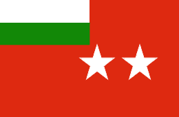
Uzbekistan is the dominating nation in Central Asia. The average flag has a reduced number of stars, and the stars are arranged in the same way as in the Tajik flag:
 |
| Central Asia |
Southern Asia is basically India and neighbours. With a population of more than one billion, India's tricolour is the basis for the average Southern Asian flag. Pakistan and Bangladesh use more green, so I coloured the wheel green:
 |
| Southern Asia |
Red is the dominant colour in Southeastern Asia. White and blue are quite common, too. Thanks to the Philippines and Vietnam, the average South-East Asian flag has one star:
 |
| Southeastern Asia |
The People's Republic of China is the largest country in Eastern Asia. Because white dominates the flags of both Japan and the Republic of Korea, I have coloured the stars white. The average number of stars is smaller than the PRC's:
 |
| Eastern Asia |
The average flag for the whole Asian continent, from Istanbul to Tokyo, is mostly red (as in China), with lots of white and green (as in India). The average Asian flag has two stars. Note that the Western Asian flag uses Turkey's shade of red and Saudi Arabia's shade of green, whereas the pan-Asian flag uses China's shade of red and India's shade of green:
 |
| Asia |
Oceania
Oceania is the smallest and least populous of the UN regions. Its westernmost subregion consists of two countries with similar flags, Australia and New Zealand:
 |
| Australia & New Zealand |
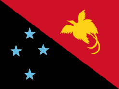
More than 4/5 of Melanesians live in Papua New Guinea. The subregion's average flag has one less star, which I have coloured in the sky blue of Fiji. Most British-based ensigns have a ration of 1:2, whereas the PNG flag has a 3:4 ratio, making it appear almost square in comparison:
 |
| Melanesia |
Micronesia consists of five countries whose total population is less than that of cities like Coventry, England or Pittsburgh, Pennsylvania. They have unusual flag designs, though. The average flag is a mix of Kiribati's and the FSM's:
 |
| Micronesia |
Since I don't count the French possessions, Polynesia only consists of Samoa, Tonga and Tuvalu, although the latter hardly counts for the average:
 |
| Polynesia |
Almost 2/3 of all Oceania's population is in Australia. The fact that the average Oceanian flag looks more like New Zealand's is due to the dominance of the red colour and the average number and shape of the stars:
 |
| Oceania |
Antarctica
Antarctica, the southern continent, has an official flag. But as there is no independent country on the continent, and the only human population are researchers, I did not include it here.
Global Average, 2018
And now for The Average World Flag. The average national flag of a UN member state, weighted by population, has three colours, two or three stripes, four stars. The average width/length ratio is about 7:11 or 1:1.57. Red is by far the most common colour, followed by white and green. Blue is the 4th most common colour, but most flags do not have more than 3 colours:
 |
| Average National Flag, Earth, 2018 |
Yes, it is a mix of China and India, the world's most populous countries.


No comments:
Post a Comment